May 6, 2026·4 min read
■⏢▤▩▰⏢◍
There was no plan. There was Illustrator open, a grid appearing on the artboard, and something that felt like a decision without quite being one. A gradient dropped in. A rectangle aligned to nothing in particular. And then another, and another, until the screen held something that looked like it meant something.
That is how ■⏢▤▩▰⏢◍ began.
The Name You Cannot Say
The title of this collection is not a word. It is not an acronym. It does not abbreviate anything.
■⏢▤▩▰⏢◍ is a sequence of Unicode symbols, and those symbols are the collection itself in compressed form: a square, a frame, a grid, a filled cell, a rectangle, a frame again, a circle. The same vocabulary the works are built from, distilled into seven characters.
A name you cannot pronounce is a name that resists being spoken about in passing. It has to be looked at. That felt right for a collection that is also, in the end, about looking at shapes.
Illustrator as a Canvas
Illustrator is a tool for logos, for packaging, for infographics. It is precise in a way that makes sense when something needs to be printed at any scale without falling apart. Using it to make art that will exist only on a screen, traded on a blockchain, never printed, feels slightly off. That tension was something I noticed but did not try to resolve.
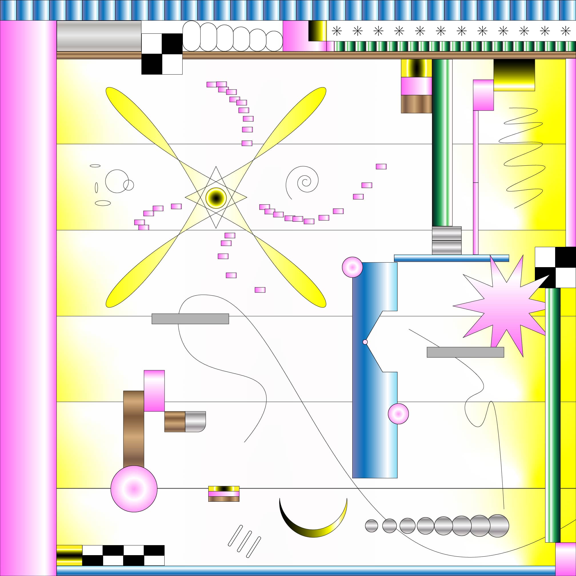
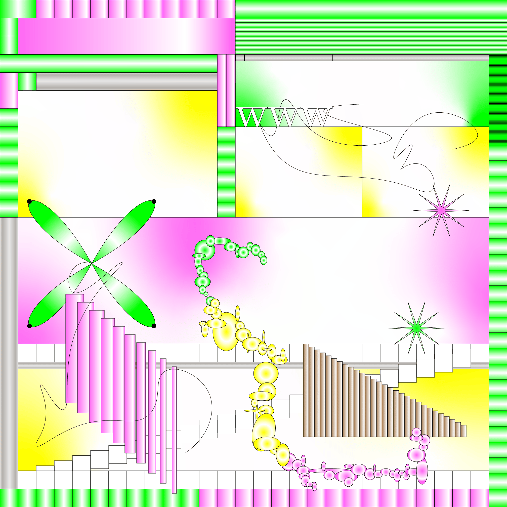
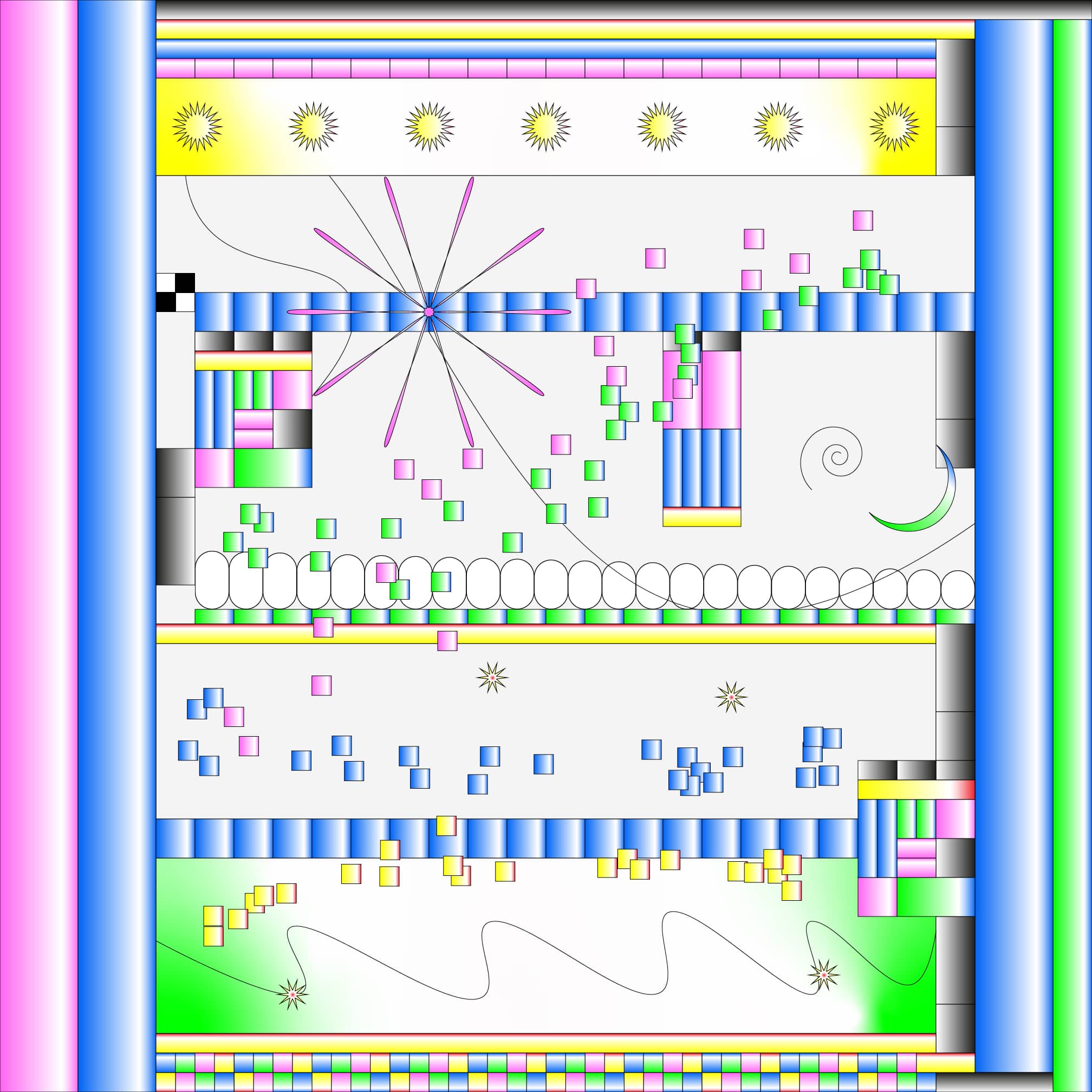
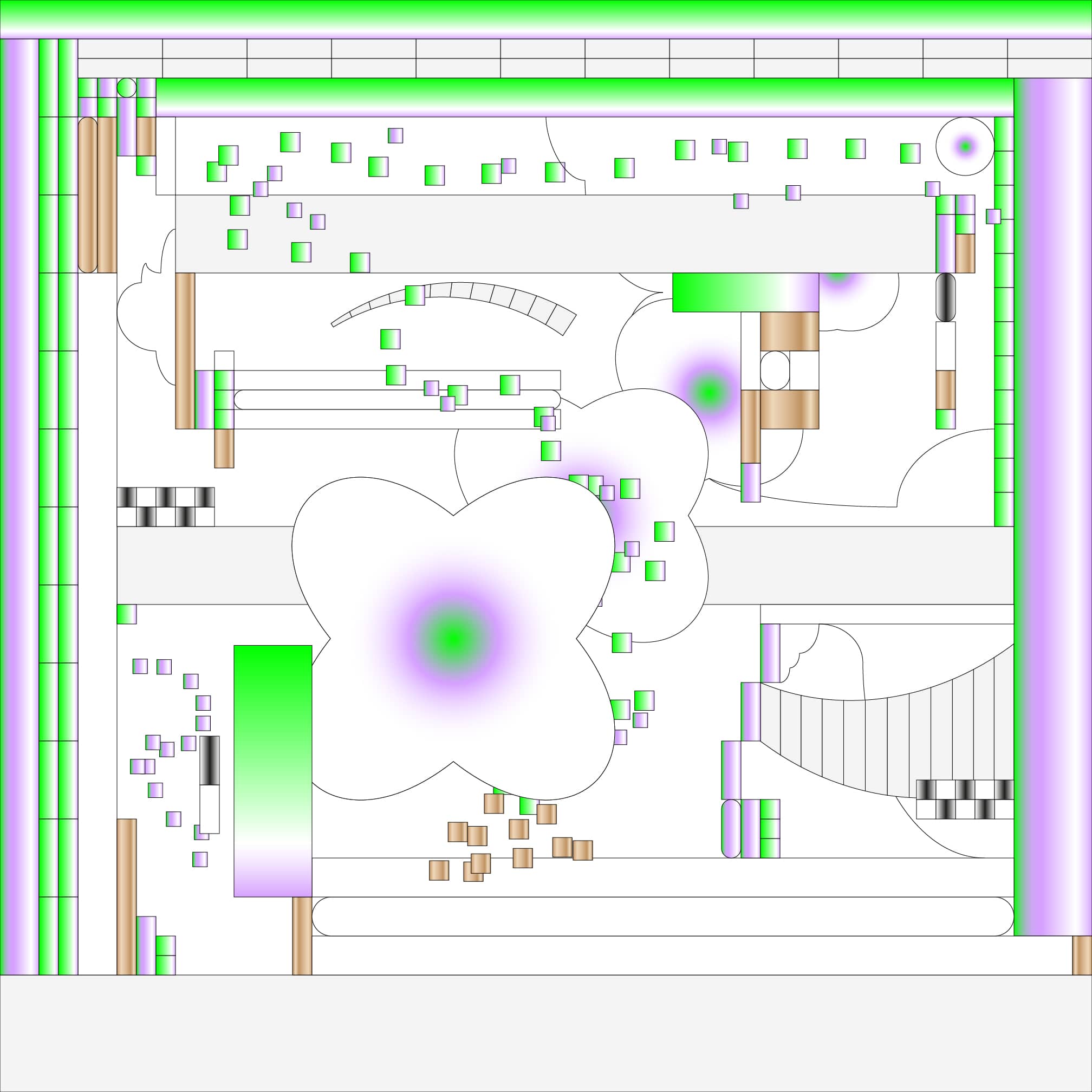
The works in this collection are built from the tools Illustrator gives you without resistance: the align panel, the grid, the gradient editor, the pathfinder. No plugins, no scripts. Just the software doing what it was designed to do, applied to questions it was not designed to answer.
Grids became compositions. Gradients stopped describing light and started describing something less nameable. Bright colors arrived without justification and stayed.
The Languages
The titles of the works move through languages: Spanish, French, German, Italian, English, sometimes something harder to place. There is no system behind this. It is closer to a habit of reaching, the way you might find yourself humming in a language you do not speak, because the sound fits the mood better than anything you have words for.
Fernweh is a German word for longing toward somewhere distant, not homesickness but its inverse. There is no English equivalent. Olvida quien eres is Spanish for forget who you are, and it lands differently than the translation does. Something changes in the mouth before it reaches the mind.
The languages are not decoration. They carry weight that shifts with the sounds, and the sounds shift the works they name.
The Color
The works in ω𝔦𝓃𝔻𝐨𝐰ˢ are gray. All of them, almost entirely. That was a constraint that arrived early and held.
Here the constraint is the opposite. The colors in ■⏢▤▩▰⏢◍ are not muted. They do not apologize. A teal grid against a magenta background. A cadmium orange shape sitting inside a composition of blues. Colors chosen for the friction they produce against each other, not for the harmony.
I do not think this collection is louder than the other. It is differently inhabited. The gray of ω𝔦𝓃𝔻𝐨𝐰ˢ is the color of waiting, of the interface before it is used. The color here is the interface mid-use, mid-thought, mid-experiment.
What Keeps Going
The collection is not finished. I am not certain what finished would mean for it, whether it is a number of works or a feeling of completion that has not arrived yet.
What I know is that it started without a destination and is still moving in that direction. Each work is a decision made without the previous ones being consulted, and yet they hold together, because they share a vocabulary even when they disagree about how to use it.
That is the thing about experiments. They do not end when you find the answer. They end when you stop being curious about the question. I have not stopped.